Welcome to our store!

/* What it does: Remove spaces around the email design added by some email clients. */ /* Beware: It can remove the padding / Margin and add a background color to the compose a reply window. */ html, body { Margin: 0 auto !important; padding: 0 !important;
/* What it does: Remove spaces around the email design added by some email clients. */ /* Beware: It can remove the padding / Margin and add a background color to the compose a reply window. */ html, body { Margin: 0 auto !important; padding: 0 !important; width: 100% !important; } /* What it does: Stops email clients resizing small text. */ * { -ms-text-size-adjust: 100%; -webkit-text-size-adjust: 100%; text-rendering: optimizeLegibility; } /* What it does: Forces Outlook.com to display emails full width. */ .ExternalClass { width: 100%; } /* What is does: Centers email on Android 4.4 */ div[style*=”Margin: 16px 0″] { Margin: 0 !important; } /* What it does: Stops Outlook from adding extra spacing to tables. */ table, th { mso-table-lspace: 0pt; mso-table-rspace: 0pt; } /* What it does: Fixes Outlook.com line height. */ .ExternalClass, .ExternalClass * { line-height: 100% !important; } /* What it does: Fixes webkit padding issue. Fix for Yahoo mail table alignment bug. Applies table-layout to the first 2 tables then removes for anything nested deeper. */ table { border-spacing: 0 !important; border-collapse: collapse !important; border: none; Margin: 0 auto; direction: ltr; } div[style*=”Margin: 16px 0″] { Margin: 0 !important; } /* What it does: Uses a better rendering method when resizing images in IE. */ img { -ms-interpolation-mode: bicubic; } /* What it does: Overrides styles added when Yahoo’s auto-senses a link. */ .yshortcuts a { border-bottom: none !important; } /* What it does: Overrides blue, underlined link auto-detected by iOS Mail. */ /* Create a class for every link style needed; this template needs only one for the link in the footer. */ /* What it does: A work-around for email clients meddling in triggered links. */ *[x-apple-data-detectors], /* iOS */ .x-gmail-data-detectors, /* Gmail */ .x-gmail-data-detectors *, .aBn { border-bottom: none !important; cursor: default !important; color: inherit !important; text-decoration: none !important; font-size: inherit !important; font-family: inherit !important; font-weight: inherit !important; line-height: inherit !important; } /* What it does: Overrides blue, underlined link auto-detected by Gmail. */ u #body a { color: inherit; text-decoration: none; font-size: inherit; font-family: inherit; font-weight: inherit; line-height: inherit; } /* What it does: Prevents Gmail from displaying an download button on large, non-linked images. */ .a6S { display: none !important; opacity: 0.01 !important; } /* If the above doesn’t work, add a .g-img class to any image in question. */ img.g-img div { display: none !important; } /* What it does: Prevents underlining the button text in Windows 10 */ a, a:link, a:visited { color: #f15d95; text-decoration: none !important; } .header a { color: #c3c3c3; text-decoration: none; text-underline: none; } .main a { color: #f15d95; text-decoration: none; text-underline: none; word-wrap: break-word; } .main .section.customer_and_shipping_address a, .main .section.shipping_address_and_fulfillment_details a { color: #000000; text-decoration: none; text-underline: none; word-wrap: break-word; } .footer a { color: #0000ee; text-transform: none; text-decoration: none; text-underline: none; } /* What it does: Overrides styles added images. */ img { border: none !important; outline: none !important; text-decoration: none !important; } /* Section specific premailer ignores */ td.menu_bar_1 a:hover, td.menu_bar_6 a:hover { color: #f15d95 !important; } th.related_product_wrapper.first { border-right: 14px solid #f5f5f5; } th.related_product_wrapper.last { border-left: 14px solid #f5f5f5; } /* What it does: Fixes fonts for Google WebFonts; */ [style*=”Nunito”] { font-family: ‘Nunito’, -apple-system, BlinkMacSystemFont, ‘Segoe UI’, Arial, sans-serif !important; } [style*=”Lato”] { font-family: ‘Lato’, -apple-system, BlinkMacSystemFont, ‘Segoe UI’, Arial, sans-serif !important; } [style*=”Lato”] { font-family: ‘Lato’, -apple-system, BlinkMacSystemFont, ‘Segoe UI’, Arial, sans-serif !important; } [style*=”Lato”] { font-family: ‘Lato’, -apple-system, BlinkMacSystemFont, ‘Segoe UI’, Arial, sans-serif !important; } @media only screen and (max-width:480px) { th.column_logo { text-align: center; display: block !important; } .logo-mobile-left { Margin: 0 auto 0 0 !important; } .logo-mobile-right { Margin: 0 0 0 auto !important; } .logo-mobile-center { Margin: 0 auto !important; } } /* Media Queries */ /* What it does: Removes right gutter in Gmail iOS app */ @media only screen and (min-device-width: 375px) and (max-device-width: 413px) { /* iPhone 6 and 6 */ .container { min-width: 375px !important; } } /* Main media query for responsive styles */ @media only screen and (max-width:480px) { /* What it does: Overrides email-container’s desktop width and forces it into a 100% fluid width. */ .email-container { width: 100% !important; min-width: 100% !important; } /* What it does: Sets more reasonable mobile line heights */ h1, h2, h3 { line-height: 1.4 !important; } /* What it does: Forces images to resize to the width of their container. */ img.fluid, img.fluid-centered { width: 100% !important; min-width: 100% !important; max-width: 100% !important; height: auto !important; Margin: auto !important; box-sizing: border-box; } /* and center justify these ones. */ img.fluid-centered { Margin: auto !important; } /* What it does: Forces table cells into full-width rows. */ th.stack-column, th.stack-column-left, th.stack-column-center, th.related_product_wrapper, .column_1_of_2, .column_2_of_2 { display: block !important; width: 100% !important; min-width: 100% !important; direction: ltr !important; box-sizing: border-box; } /* and left justify these ones. */ th.stack-column-left { text-align: left !important; } /* and center justify these ones. */ th.stack-column-center, th.related_product_wrapper { text-align: center !important; border-right: none !important; border-left: none !important; } .column_button, .column_button>table, .column_button>table th { width: 100% !important; text-align: center !important; Margin: 0 !important; } .column_1_of_2 { padding-bottom: 28px !important; } .column_1_of_2 th { padding-right: 0 !important; } .column_2_of_2 th { padding-left: 0 !important; } .column_text_after_button { padding: 0 14px !important; } /* Padding */ .section_border { padding-right: 14px !important; padding-left: 14px !important; } .section_content { padding-right: 28px !important; padding-left: 28px !important; } .recommended_products .section_content .related_products_title { padding-right: 28px !important; padding-left: 28px !important; } .recommended_products .section_content { padding-right: 0 !important; padding-left: 0 !important; } /* Adjust product images */ img.product-image, img.related_product_image { width: 80px !important; max-width: 80px !important; } /* Text align adjustments */ .column_1_of_2 th p, .column_2_of_2 th p, .order_notes * { text-align: left !important; } .column_text_after_button { text-align: center !important; } .column_text_after_button * { text-align: center !important; } .line-item-description p { text-align: left !important; } .line-item-price p, .line-item-qty p, .line-item-line-price p { text-align: right !important; } h2, h3, .column_1_of_2 th, .column_2_of_2 th { text-align: left !important; } td.order-table-title { text-align: left !important; } /* Padding adjustments */ tr.row-border-bottom th.product-image-wrapper { border-bottom: none !important; } th.related_product_wrapper.first, th.related_product_wrapper.last { padding-right: 0 !important; padding-left: 0 !important; } .text_banner th.banner_container { padding: 14px !important; } .mobile_app_download .column_1_of_2 .image_container { padding-bottom: 0 !important; } .mobile_app_download .column_2_of_2 .image_container { padding-top: 0 !important; } .image_with_text th.column_1_of_2 { padding: 28px !important; padding-bottom: 14px !important; } .image_with_text th.column_2_of_2 { padding: 28px !important; padding-top: 14px !important; } .images_in_2_columns th.column_1_of_2 { padding: 0 !important; padding-bottom: 14px !important; } .images_in_2_columns th.column_2_of_2 { padding: 0 !important; padding-top: 14px !important; } } /* Custom Media Queries */ @media only screen and (max-width:480px) { .footer th.column_2_of_2 { padding-top: 28px; border-top: 3px solid #f15d95 !important; } .footer th.column_menu_block { padding: 0 !important; border: 0 !important; } td.menu_bar_6 { padding-bottom: 0 !important; } } /* Custom Media Queries */ @media only screen and (max-width:480px) { .footer th.column_2_of_2 { border-top: 0 !important; border-bottom: 0 !important; } } Welcome, your customer account is now active! The next time you shop with us, you can save time at checkout by logging into your account.
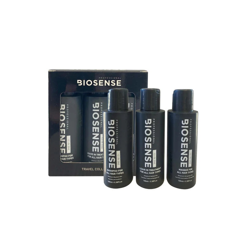
Indulge in the ultimate hair care experience with the Biosense 12 in 1 Travel Set, a complete hair care solution that revitalizes and transforms your locks. Discover the power of three essential products formulated to nourish, repair, and rejuvenate your hair.
The Biosense 12 in 1 Travel Set includes three essential products designed to meet all your hair care needs:
Biosense 12 in 1 Shampoo 125ml: Start your hair care routine with the gentle cleansing power of Biosense 12 in 1 Shampoo. Formulated to provide deep hydration, this shampoo leaves your hair soft, smooth, and manageable.
Biosense 12 in 1 Masque 125ml: Treat your hair to a luxurious spa-like experience with Biosense 12 in 1 Masque. Enriched with antioxidants and vitamins, this masque restores strength and vitality to your locks, leaving them feeling nourished and revitalized.
Biosense 12 in 1 Treatment 12ml: Experience the benefits of multiple hair treatments in one convenient product. Biosense 12 in 1 Treatment offers intense hydration, reduces frizz, protects against heat damage, and enhances manageability, giving you salon-worthy results with every use.
Say goodbye to multiple hair care products and hello to a comprehensive solution with Biosense 12 in 1 Travel Set. Whether your hair needs hydration, repair, or protection, this gift set has you covered, delivering results you can see and feel.
For best results, incorporate the Biosense 12 in 1 Travel Set into your hair care routine. Start by cleansing with Biosense 12 in 1 Shampoo, then indulge in the nourishing benefits of Biosense 12 in 1 Masque. Finish with Biosense 12 in 1 Treatment to lock in moisture and protect your hair from daily damage.
Transform your hair care routine with Biosense 12 in 1 Travel Set and experience the difference in the health and vitality of your locks. Treat yourself or someone special to this luxurious gift set and discover the secret to beautiful, salon-worthy hair.
Reviews
There are no reviews yet.